Contemporary Design Or Tool First
Contemporary design has lost its soul
As technology and efficiency improve, our products have become less beautiful and unique
![]()
D esign influences the world in many ways, from user experience and branding to architecture and engineering. A practical and elegant method of implementing design is by utilizing the well-known principle that form follows function. This notion implies that design decisions are quantified with purpose and grounded in efficiency and practicality — nothing more and nothing less. However, this utopian methodology can result in designs that come across as sterile and predictable.
Simply Bland
The continued growth of the u s er experience industry has impacted the design field indefinitely. Much of contemporary design gets driven by UX information such as accessibility standards, research, and data. Overall, these objective methods and determinations yield more usable products and services. But more importantly, it produces satisfied users, thus leading to a more holistic and profitable business model.
If we examine websites from tech industry giants such as Apple, Microsoft, Facebook, and Google, aesthetically speaking, we can see their designs are neutral, simple, and clean — plenty of white space and contrast for accessibility, hierarchy, and navigation. However, they have substituted clinical and quantitative for what could have been unique and authentic. They do not take any creative risks by exploring colors, bold graphics, or typography. Their designs are safe, sterile, and impersonal.
The logic behind the requirement for specific digital applications and websites to be void of anything other than their intended purpose is self-evident. However, I believe large-scale companies such as Apple, Google, and Microsoft influence the design community considerably. And if you have been designing for as long as I have, their impact on compositions produced by the general design population is evident. Even the direction given by stakeholders starts to evolve into whatever visual identity these big tech companies have taken over — regardless if it is suitable, applicable, or appropriate. There are always design trends that sweep the web every so often, and at the moment, there is an obsession with oversimplification and hyper-inclusive design and user experience.
10 to 20 years ago, websites were wildly creative in their aesthetics and usability. Of course, this was terrible for achieving a good user experience, but there was something to be said for the unique and imaginative exploration of design concepts at that time. There were no rules to follow. This ignorance and freedom led to many failures, but it also inspired some of the design foundations we utilize to this day.
It appears the more we have learned about user behavior, and the better technology has become regarding analytics and data, the more websites have morphed into neutered cookie-cutter versions of their former free-spirited roots. Akin to our open-minded younger selves tamed by education, responsibilities, and peer pressure, convinced that the only way to succeed is to blend in.
The automotive industry is an excellent example of this subtle transformation of how knowledge has to lead to better, yet at the same time, soulless products.
Wings Without Purpose

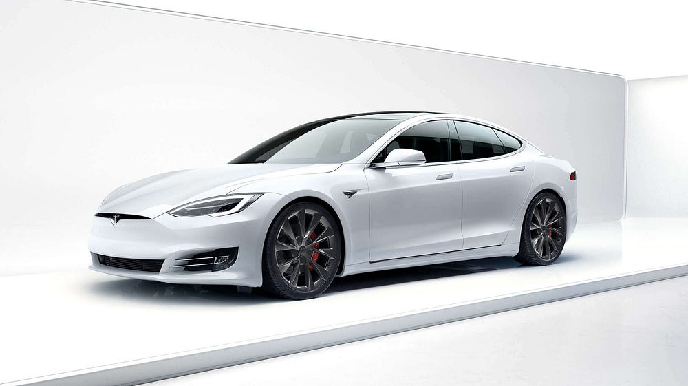
The 2021 Tesla Model S Plaid, an electric vehicle (EV), recently managed a 0–60 mph in 1.99 seconds, becoming one of the fastest production cars ever. This status is notable, as it appears you can have your cake and eat it too, regarding the combination of balancing environmental friendliness and performance supercar.
Telsa engineers their cars with the concept that form follows function. The body is sculpted using data from wind tunnel testing to guide the reduction of noise and decrease energy consumption while driving. The minimalist and technologically advanced interior focus on comfort and convenience. And the powerful electric motor makes zero emissions and sound while casually speeding down the highway in its understated four-door supercar status.
Tesla attempts to be unique by incorporating tech easter eggs, falcon doors, and a ridiculously impractical yolk-steering wheel. However, I would argue that these are blatant efforts to add personality to a descriptively boring-looking automobile and comes across as a marketing gimmick for Elon fans instead.

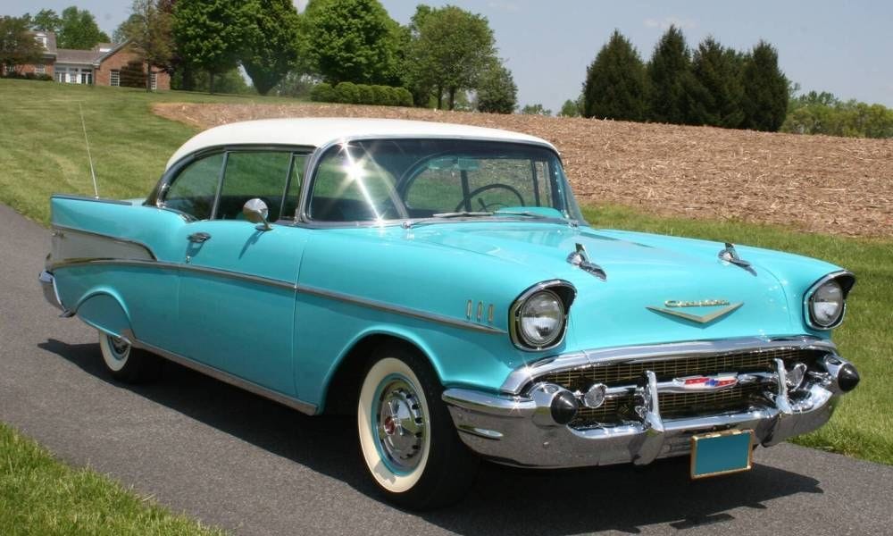
Now let us compare the Tesla to one of my favorite vintage cars, a 1957 Chevrolet Bel Air. The development of the Belair happened before our current comprehension of aerodynamics and the environmental implications of the combustion engine. Yet, in my opinion, the Bel Air has more character and soul than a modern-day EV, both aesthetically and emotionally. The Bel Air's overabundance of Chrome and jet-inspired emblems, body molding, and tail wings give the car a unique and exciting exterior. It performs the 0–60 mph much slower than the Tesla, but there is no replacement for the beautiful sound and visceral feel of an American V8 engine.
As the proud owner of a 1969 Chevrolet Camaro, I can speak firsthand to the appeal and sensations experienced by such an analog vehicle. On paper, classic automobiles are terrible at just about everything compared to modern-day cars. But they possess an unmatched character and soul as the result of being created without the knowledge that we take for granted today when developing vehicles.
Back in the 1950s and 1960s, automotive manufacturers were ignorant of the current efficiency standards we use now to design and engineer automobiles. And strangely, that is what made these classic cars unique and beautiful.
Design Objectively with Subjectivity
The requirement to make designs efficient is obvious. If we ignore research and evidence that make a structure, product, or composition more effective, it would be detrimental to the users, businesses, and the world. This notion is what separates the fields of objective design and subjective art. And while we tend to believe these two domains should be separate, the reality is that art produces beauty and character, which add immeasurable value to the things we interact with — something quantitative methods lack in implementation.
I am not suggesting that we go around adding unnecessary elements to our designs for the heck of it. However, it is essential to look at the data and make calculated decisions that sometimes go against efficiency and logic to add character to produce something beautiful, unique, and meaningful.
Contemporary Design Or Tool First
Source: https://uxdesign.cc/contemporary-design-has-lost-its-soul-a8a43c00d5aa
Posted by: harringtongraints.blogspot.com

0 Response to "Contemporary Design Or Tool First"
Post a Comment